On the charts, both gold and the U.S. equity market are positioning for a meaningful upside move, with technical structures suggesting continued strength ahead.
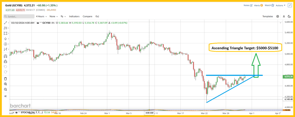
A look at the short-term gold chart shows a clean ascending triangle formation, with price coiling beneath resistance and building pressure for a breakout. The measured move from this setup points toward the $5,000–$5,100 range.
That implies a strong continuation for those who accumulated during the dip into the $4,100 zone. Even more notable is that, despite the roughly $400/oz rally off the lows, gold still appears to be trading within a broader buy zone rather than an overextended blow-off phase.
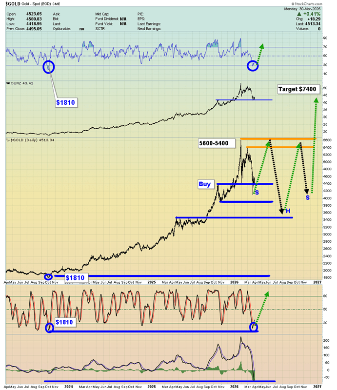
On the daily timeframe, gold may be forming a large continuation structure, with a projected move that could extend beyond the $7,000 level.
At the same time, momentum indicators are deeply stretched to the downside. The MACD (20,40,10) is at one of its most oversold readings in years, and both the Stochastic (14,7,7) and RSI are showing similarly extreme conditions. This kind of setup often precedes a strong upside continuation once momentum resets.
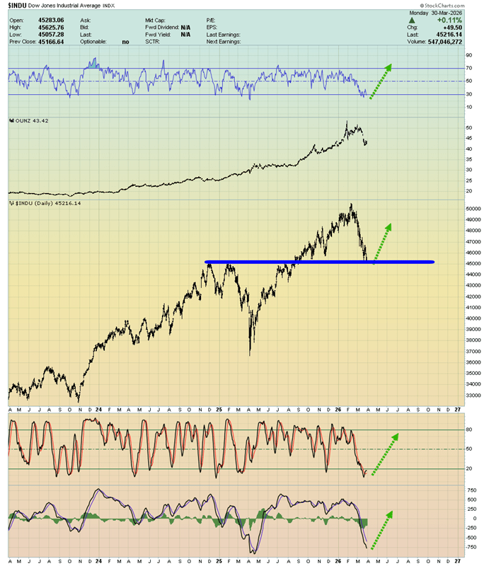
The U.S. stock market “buy zone” setup reinforces the bullish case. When the Dow Jones Industrial Average and gold simultaneously test strong support levels, it often creates some of the most favorable entry points across gold, silver, and mining equities.
Right now, the Dow is sitting near the 45,000 level—a technically significant support zone—while key momentum indicators like RSI, MACD, and Stochastics are deeply oversold. That mirrors the condition in gold, where downside momentum appears exhausted.
In simple technical terms, this is a coordinated setup: gold is the asset with explosive upside potential, while the stock market provides the broader risk-on backdrop that helps fuel the move. If both stabilize and turn higher together, it creates the kind of alignment that can drive powerful upside trends across the precious metals complex.
From a fundamental perspective, the messaging backdrop matters as much as the data. When policymakers try to stabilize sentiment, it’s far more effective when the Dow Jones Industrial Average is sitting at a major technical support zone—like the 45,000 area. Strong support gives credibility to optimistic guidance; it’s easier to “talk up” markets that are already positioned to bounce.
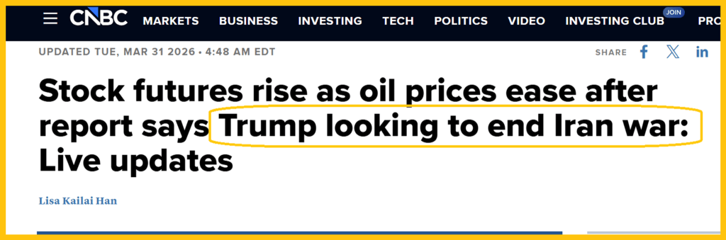
The geopolitical layer adds another dimension. A potential de-escalation or deal involving United States and Iran would be a key variable, particularly through the energy channel. While the timing and likelihood remain uncertain, the market clearly needs some form of resolution to stabilize expectations.
The chokepoint is the Strait of Hormuz—a critical artery for global oil flows. If disruptions persist and the passage isn’t fully normalized, supply constraints could intensify. Right now, the pressure is being felt more acutely across parts of Asia, but energy executives warn that shortages could begin affecting Western economies within weeks if conditions don’t improve.
That feeds directly back into inflation. Sustained energy tightness keeps input costs elevated, which complicates central bank policy just as labor markets are softening. So while the technical setup points higher, the fundamental story hinges on whether energy pressures ease—or continue to reinforce the inflation side of the equation that’s already limiting policy flexibility.
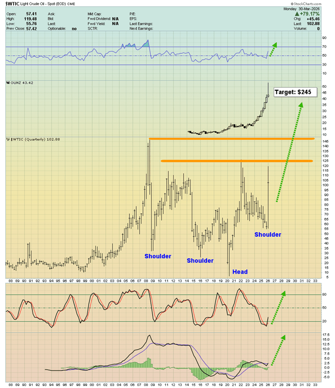
A striking long-term oil chart is emerging, showing a major head-and-shoulders formation, with a potential price target around $245.
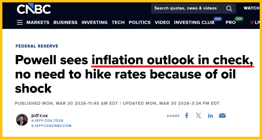
Curiously, the U.S. central bank seems to be brushing off the risks of a debt-financed war and rapidly building stagflation.
Meanwhile, surging fuel costs are crushing truckers, pushing some into bankruptcy. Airlines are raising fees, traffic through Hormuz has plunged from around 150 ships a day to just a handful, yet Fed Chair Jay Powell appears largely unfazed.
Equities may still be gearing up for another record run, potentially coinciding with oil pulling back toward the $70–$80 range. But beyond that…
Western investors may soon face a harsh realization: soaring oil prices, stagflation, excessive debt, and war are no longer the clear bearish signals for gold they were once thought to be.
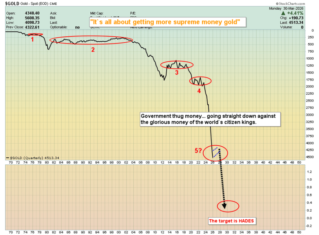
The “March to Hades” chart highlights the long-term decline of U.S. fiat relative to gold.
Mainstream narratives often frame gold as a risky asset—something investors trade occasionally for large fiat gains. But in reality, the currency dynamic is the reverse. Seasoned gold advocates view gold as the superior form of money, meaning fiat should be used as the trading vehicle to accumulate more gold—locking in gains not in dollars, but in ounces.
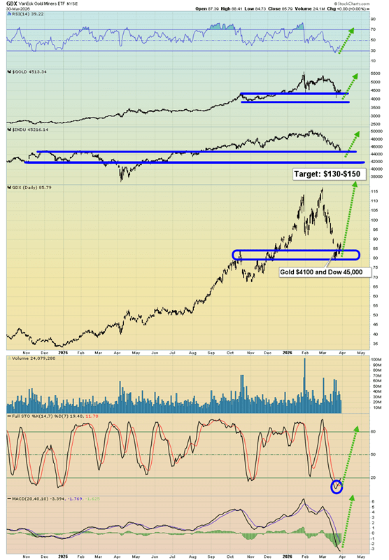
Miners? The GDX daily chart looks exceptional—arguably a “chart of the year” contender.
At its core, a powerful technical setup is unfolding: the Dow, gold, and GDX are all testing support levels simultaneously, with oscillators flashing buy signals across the board.
The GDX chart itself appears remarkably clean—almost pristine.
For momentum traders, this could be an attractive entry point. Personally, I’d consider small positions in U.S. equities, while taking more meaningful exposure to gold, silver, and mining stocks. For gold-focused investors, it may be time to part with some fiat and lean into the opportunity on the buy side.
Sources: Stewart Thomson

Leave a comment