Did you know that a form of technical analysis shares structural patterns with hurricanes, nautilus shells, sunflowers, music, and even human proportions? These phenomena—along with countless others—adhere to ratios derived from a numerical sequence: 0, 1, 1, 2, 3, 5, 8, 13, 21, 34, 55, 89… Known as the Fibonacci sequence, these numbers generate ratios that are widely used as a technical framework for analyzing and managing financial markets.
Before it sounds like we’re turning to biology—or worse, mysticism—to forecast stock prices, let’s explain how this concept is applied in a practical, market-driven way.
Fibonacci Patterns Are Everywhere
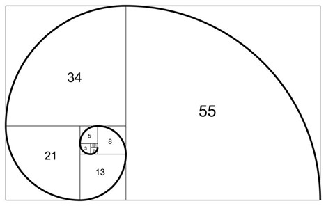
As shown in the diagram, drawing quarter-circle arcs across adjacent squares whose side lengths follow the Fibonacci sequence (1, 1, 2, 3, 5, 8, 13, 21, and so on) creates an expanding spiral that closely resembles the shape of a nautilus shell.
Each number in the sequence is the sum of the two numbers before it. Importantly, the ratios between consecutive Fibonacci numbers converge toward the golden ratio, 1.618, often referred to as Phi. Its inverse—obtained by dividing the smaller number by the larger—approaches 0.618, a relationship that underpins many Fibonacci-based applications in both nature and financial markets.
Below are several examples of natural and human-made phenomena that reflect the Fibonacci sequence and the golden ratio:
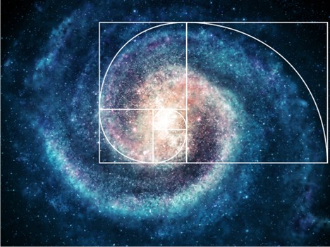
- Spiral Galaxies: The arms of some galaxies expand outward in patterns that closely resemble a Fibonacci spiral.
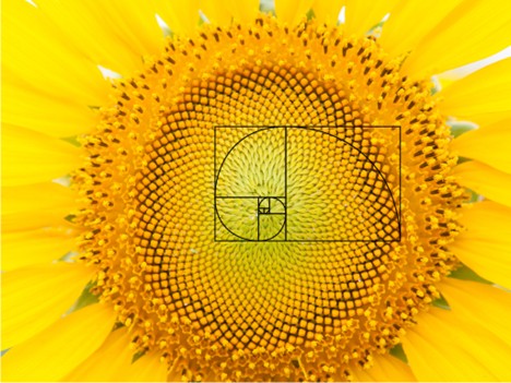
- Sunflowers: The arrangement of seeds often forms intersecting spirals—commonly 34 in one direction and 55 in the other, or sometimes 55 and 89—consistent with Fibonacci numbers.
- Cauliflower: The spiraling florets frequently appear in counts such as five, eight, or thirteen per cluster, reflecting Fibonacci-based growth patterns.
- Piano Keys: A standard octave contains 13 keys—8 white and 5 black—with the black keys grouped in sets of two and three.
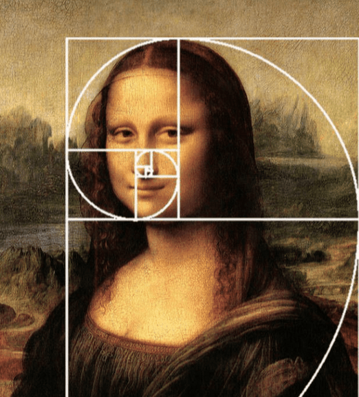
- The Mona Lisa: As noted by Math Central, the painting contains multiple golden rectangles. When a rectangle is drawn around the subject’s face, its proportions closely align with the golden ratio. Dividing this rectangle at eye level creates another golden rectangle, and similar proportions can be observed from her neck to the top of her hands.
It is widely believed that the Fibonacci sequence and the golden ratio underpin aspects of the brain’s structure and cognitive processes.
According to Professor Adrian Bejan of Duke University, as cited in The Atlantic:
“This represents the most efficient flow of visual information from the eye to the brain, which is why it so often appears in human-made designs that seem to be intentionally structured around the golden ratio.”
Market Prices and Fibonacci Relationships
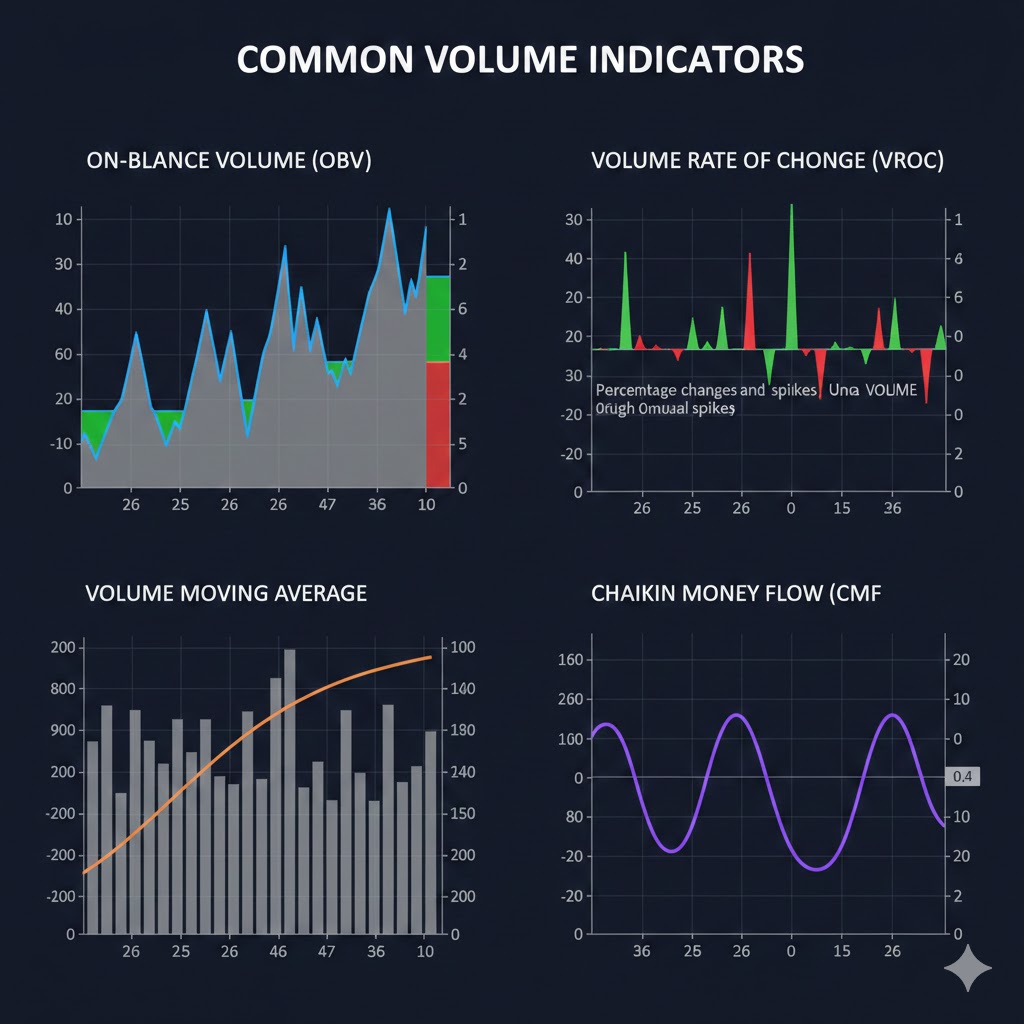
Human brains are naturally inclined to search for, recognize, and react to patterns. As a result, we subconsciously gravitate toward Fibonacci relationships and the golden ratio. This tendency helps explain why many works of art, music, and poetry incorporate Fibonacci structures. It also sheds light on why Fibonacci-based tools can be effective for market technicians in identifying support and resistance levels, as well as projecting potential breakout targets.
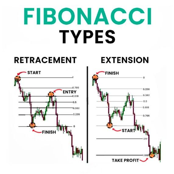
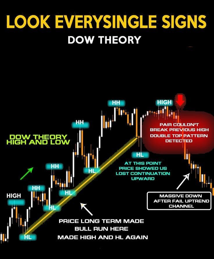
Retracements/Support
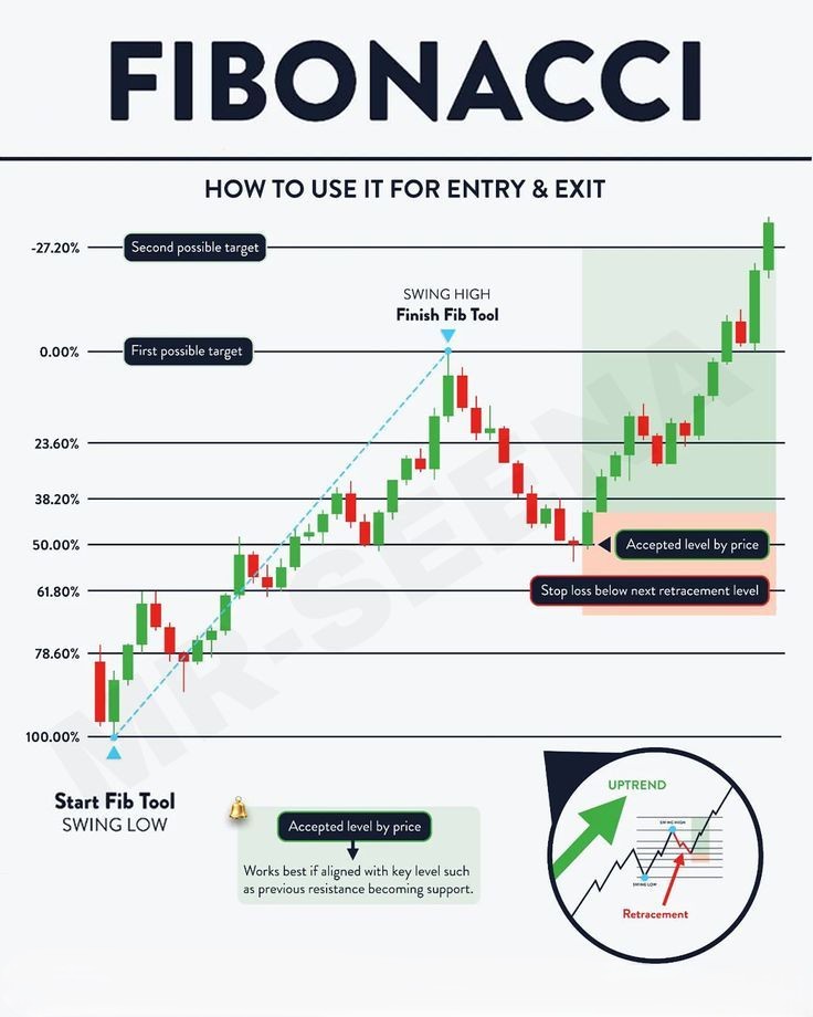
Fibonacci sequences—particularly the golden ratio—are commonly used by technicians to identify potential support and resistance levels within a defined price range.
In the example shown, the selected range starts from the early April 2025 lows and extends to the highs formed in October and December. Once this range is established, Fibonacci retracement levels are applied to identify likely areas of support. The percentages referenced represent the portion of the total price range where Fibonacci-based support is expected to emerge.
- 78.6% – Derived from the square root of the golden ratio (61.8%). While not part of the Fibonacci sequence itself, this level is widely used in Fibonacci analysis.
- 61.8% – The golden ratio, calculated from the relationship between 55 and 34 (34 ÷ 55).
- 50% – Not a true Fibonacci retracement, but the midpoint of a range is a key psychological level and is commonly included in Fibonacci studies.
- 38.2% – A two-step retracement from 55 to 21 (21 ÷ 55), often viewed as a secondary support or resistance level.
- 23.6% – A three-step retracement from 55 to 13 (13 ÷ 55), typically representing shallow pullbacks within strong trends.
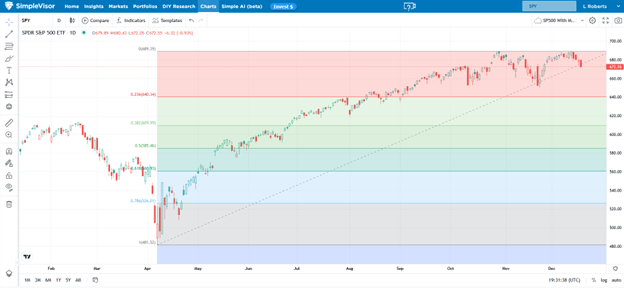
In the example above, the S&P 500 (SPY) is expected to find initial support near 640.34, which represents the first Fibonacci retracement level. The next key support area lies around 609.99, aligning with the 61.8% golden ratio retracement.
The Fibonacci chart referenced above was generated using SimpleVisor’s charting platform.
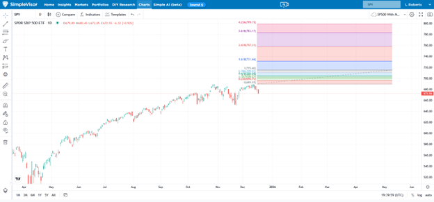
Fibonacci Extension/Profit Targets
Fibonacci analysis can also be used to project potential resistance levels once prices move to new highs. The main limitation of this approach is that it requires estimating where the trend is likely to peak, making it less reliable than the prior resistance analysis discussed earlier.
As illustrated in the chart, the same Fibonacci ratios are applied by extending the bullish trend from the recent high toward the 800 level.
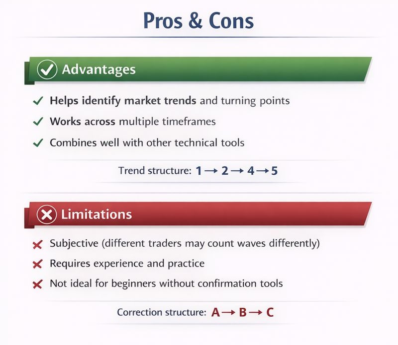
Summary
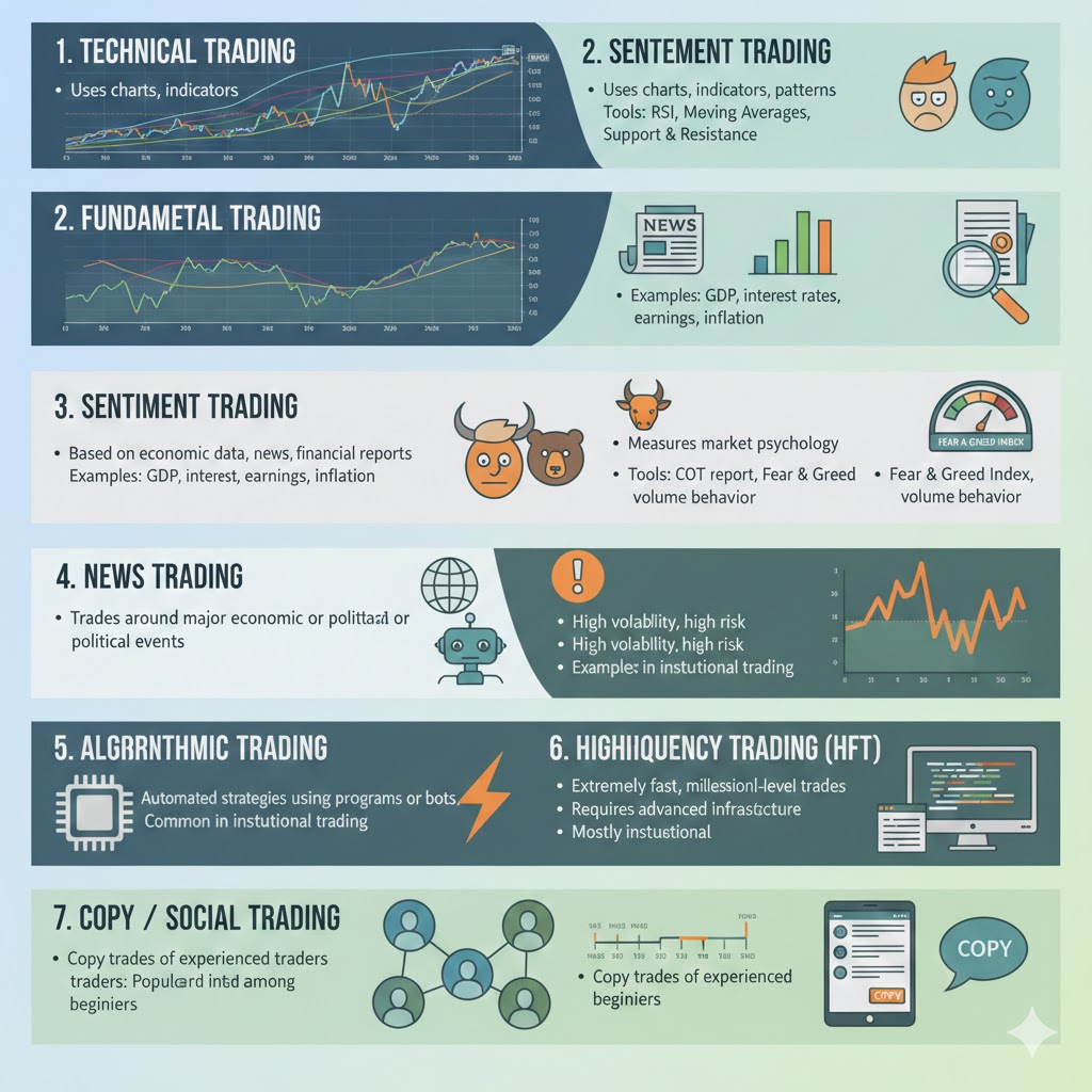
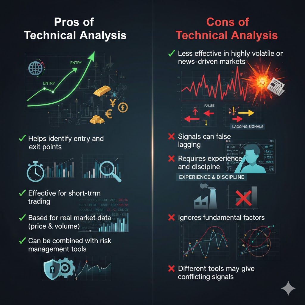
You should never depend on a single form of technical analysis. The most effective insights come from combining multiple patterns and indicators. No method is infallible, but when several approaches point to the same conclusion, the probability of a favorable outcome increases.
Although skeptics argue that Fibonacci analysis is simply pattern recognition, its widespread use across financial markets highlights its lasting value as a tool that sits at the intersection of mathematics, investor psychology, and market behavior.
Sources: Michael Lebowitz